Interactive Kiosk
Context
A both innovative and ambitious project is being developed: the creation of an interactive kiosk concept as well as its whole management ecosystem.
As a Senior Designer, I am leading the UX & UI Design, working closely with the Product Design Team (shaping the product itself) and the Development Team (in charge of the programming).
Target
Shopping centers across China
Purpose/goal
Satisfying both the customers and the retailers.
Shopper’s benefits:
- Enhancing the entire shopping experience using latest technologies
- Offering relevant answers and offers to the customers
- Instantly triggers a reveal of in-store promotions, sales, discounts and offers relevant to a search keyword, thus instantly exposing shoppers to offers in line with their interests
Shopping Centers and Retailers’ benefits:
- Monitoring instantly the degree of interest that a specific brand/product/offer is generating
- Stimulating retail sales by generating customer-relevant, traffic-generating and profitable retail promotions
Characteristics
- The most advanced 4k multimedia display technology
- Stream Media Network
- Multiple Languages
- User-friendly Screen Height Options
- Customized Display Units
- Digitally animated sales promotion displays
- Real-time Data
- Instant and Easy Management
- Customizable skins
Features
- Wayfinding system
- Keyword search programme
- Full directory search programme
- Amenities and Services search programme
- Current discount and sale offerings
- Intelligent Link to Relevant Promotions and Offers
- Specific retailer/tenant informations and profiles
- Online to Offline (020) QR Code Convenience
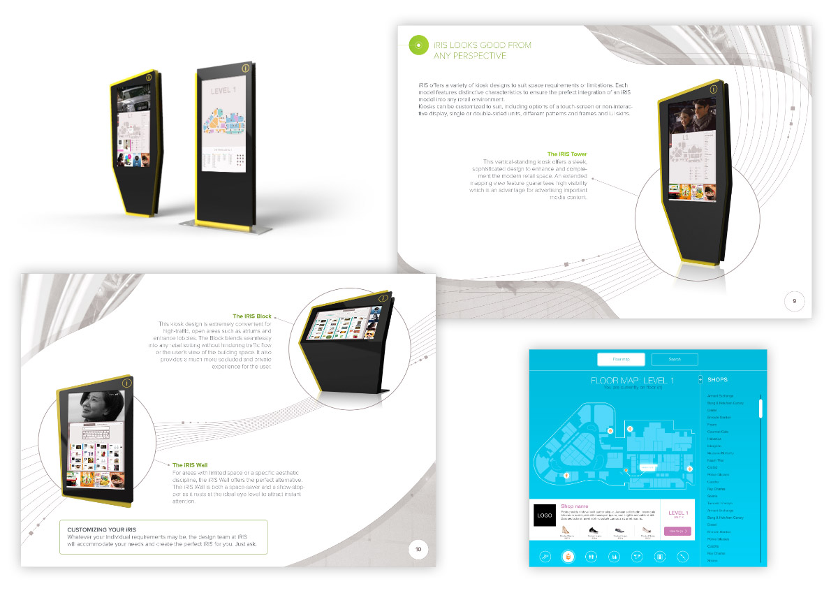
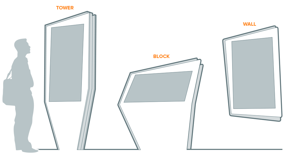
3 types of Kiosk
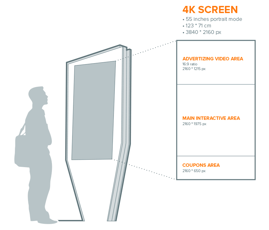
The 4K screen is divided into 3 parts:
- the upper part playing advertising videos
- the middle part devoted to user interaction (the one I’ll mainly focus on)
- the lower part displaying promotional coupons, generated randomly first and according to user’s search input eventually
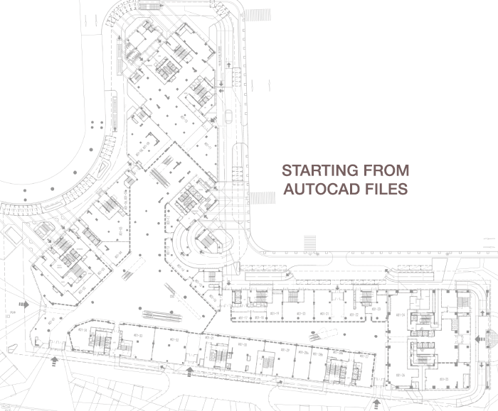
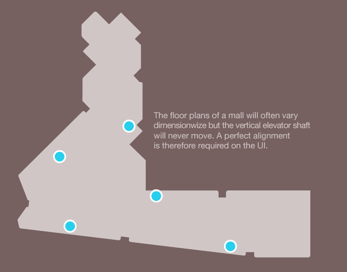
The simplification and stylisation of the floor plans required a painstaking work. I determined the process to get a consistent design from the Autocad files we were given by the different shopping malls. All the floor plans of a mall had to be perfectly aligned following the global structure, so that the lifts would always appear at the same place, especially during the animations (when floor plans appear successively on top of each other to show the route). I’ve set a visual distinction between the units related to the mall and the ones without relevance for the customers (like office units).
Then I determined all the areas customers could walk in, with specific vector shapes, so that the developers would inject it in their wayfinding system and determine the fastest routes for specific searches.
Quick diagram to keep in mind the most common users’ needs.

I worked closely with technical engineers and came up with these UIs, willing to comply with technical constraints while delivering the best user experience. Providing shoppers with the maximum efficiency was the motto.
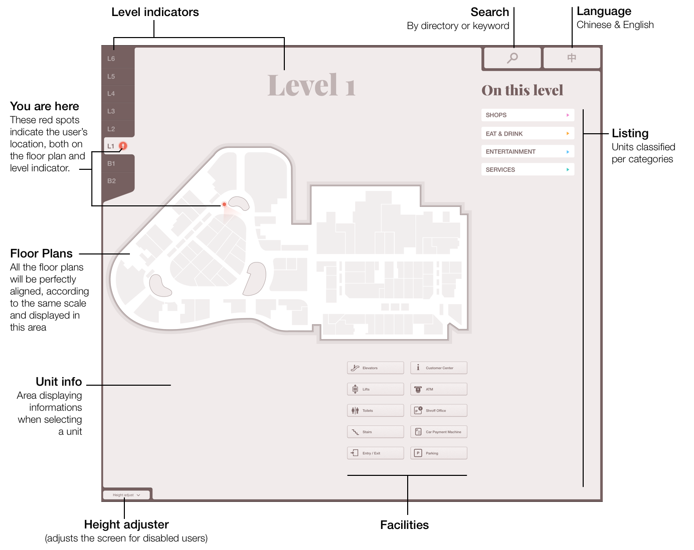
After several UI proposals and tests on the 4K screen, we realized that some colors were not rendered correctly (chromatic aberration), especially at the edge of overlapping blocs. The solution turned out to be the adoption of this pastel warm brown hues for the global interface: quite a neutral tone that wouldn’t conflict with the colors of malls’ specific categories.
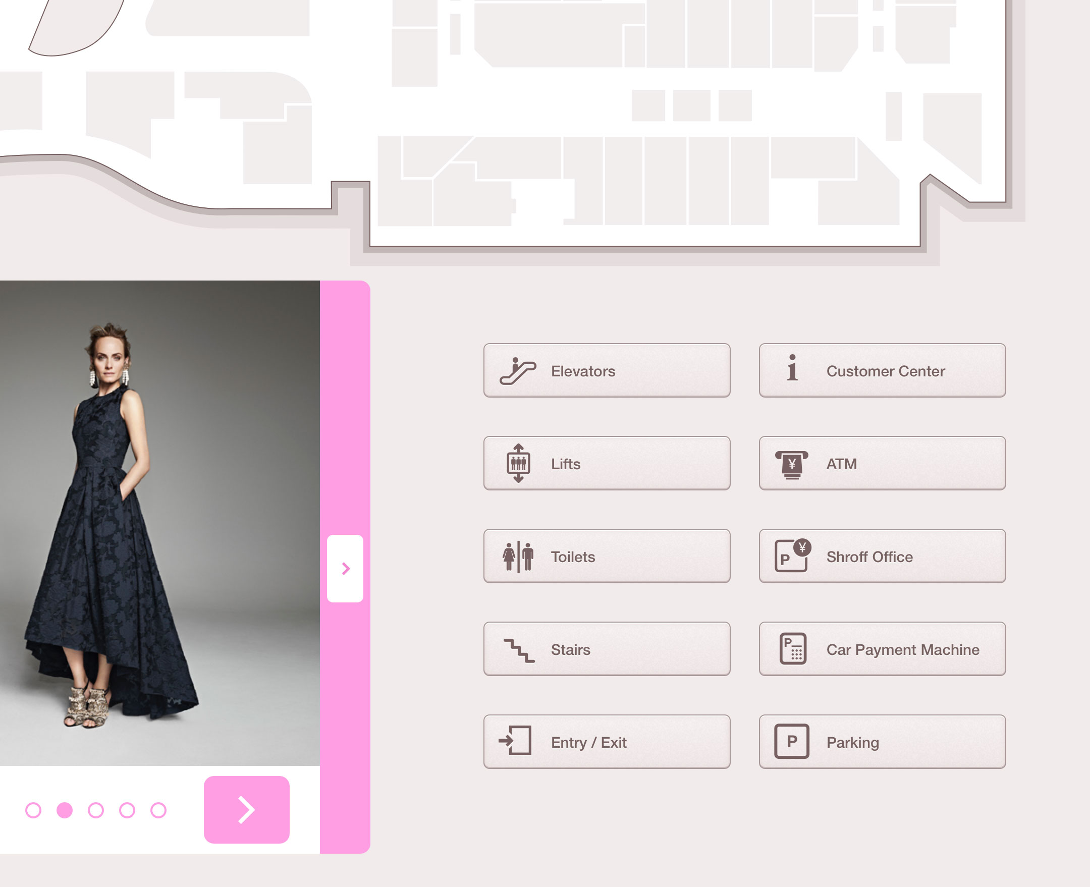
Design details: facilities’ buttons
Here are two interactive prototypes I made in order to choreograph some animations and communicate on how elements should appear on screen.
Some extracts of the promotion brochure I’ve designed.