
Designing the Telstra TV Mobile App
Context
- Year: 2017
- Role: Senior UX-UI Designer at Accedo.tv
While working at Accedo.tv’s Hong Kong office, I am assigned to temporarily take over design responsibilities for a key Australian client. The original designer, based in Sydney, has been involved since the project’s early stages but is on a one-month leave. To ensure continuity, I step in to provide design support during her absence.
The client
Telstra Corporation Limited is Australia’s largest telecom company, providing networks and services like voice, mobile, internet, and pay TV.
Telstra TV+ lets customers search over 25,000 movies and TV shows from Australian providers, including Stan, BigPond Movies, and live AFL and NRL games.
Mission: improving the UX of the Telstra TV+ mobile app
The Telstra TV+ companion app (Android & iOS) enhances the big screen experience for watching on the go. It includes features like:
- Remote control
- Universal search
- Offers and deep linking to partner apps
The app connects to the user's Telstra TV via WiFi, eliminating the need to search for lost remotes.
Challenges
1. Rapidly onboard and understand the project to ensure a seamless transition, so the client experiences no disruption.
2. Overcome geographical and time zone differences, providing remote support where the previous designer had direct on-site access.
3. Exceed client expectations to demonstrate that despite staffing changes, our team remains fully capable of delivering strong design support.
1. Working on client requests
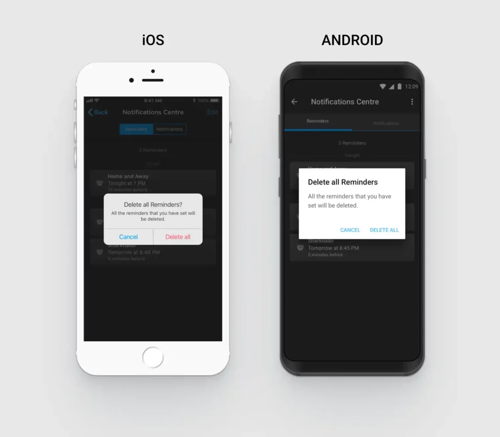
Design of a “Notification Centre”
One of my first tasks was to design a Notification Centre that served two key purposes:
- Allowing users to set personal reminders for TV programs they didn’t want to miss
- Providing a central place to receive and review push notifications sent by Telstra
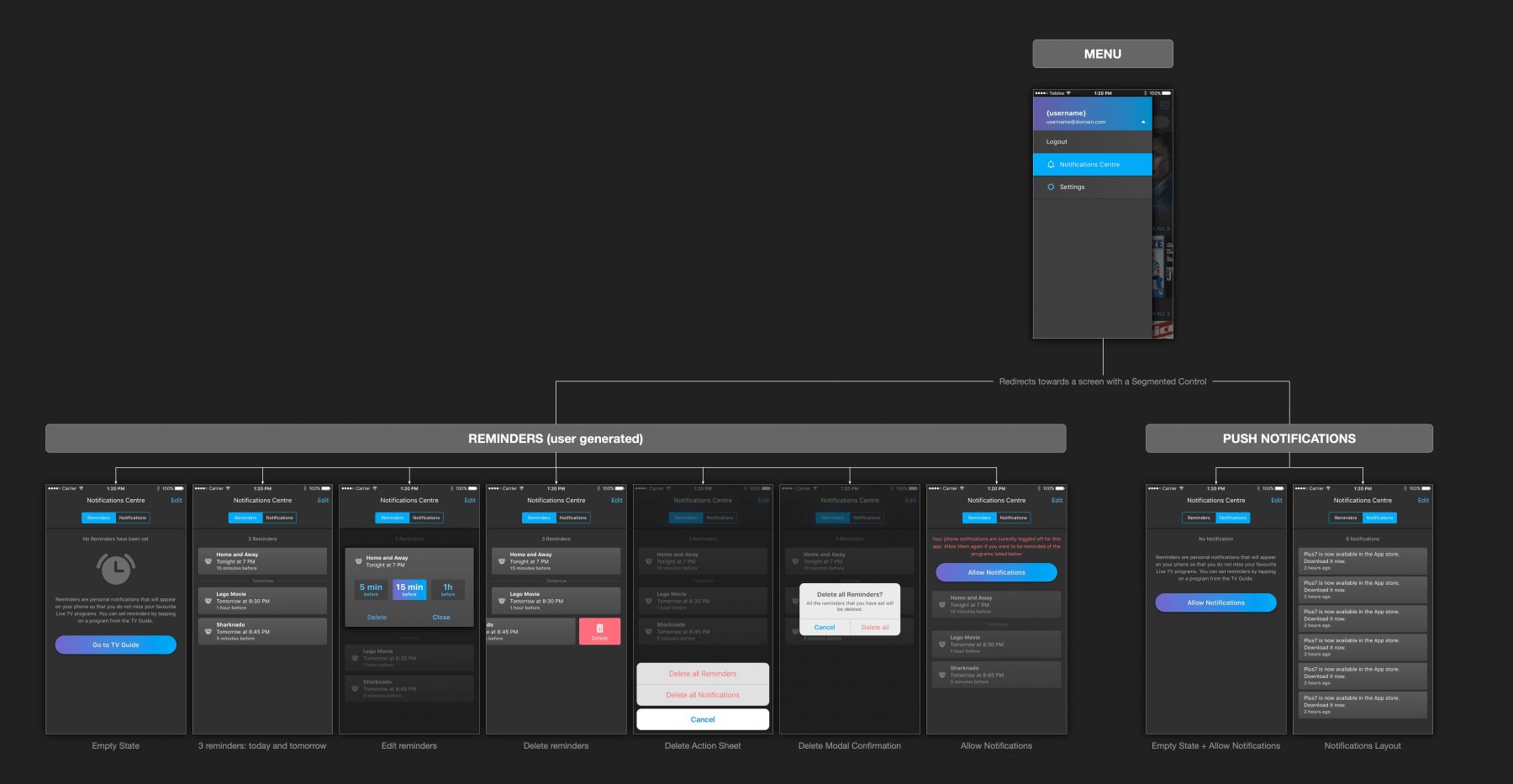
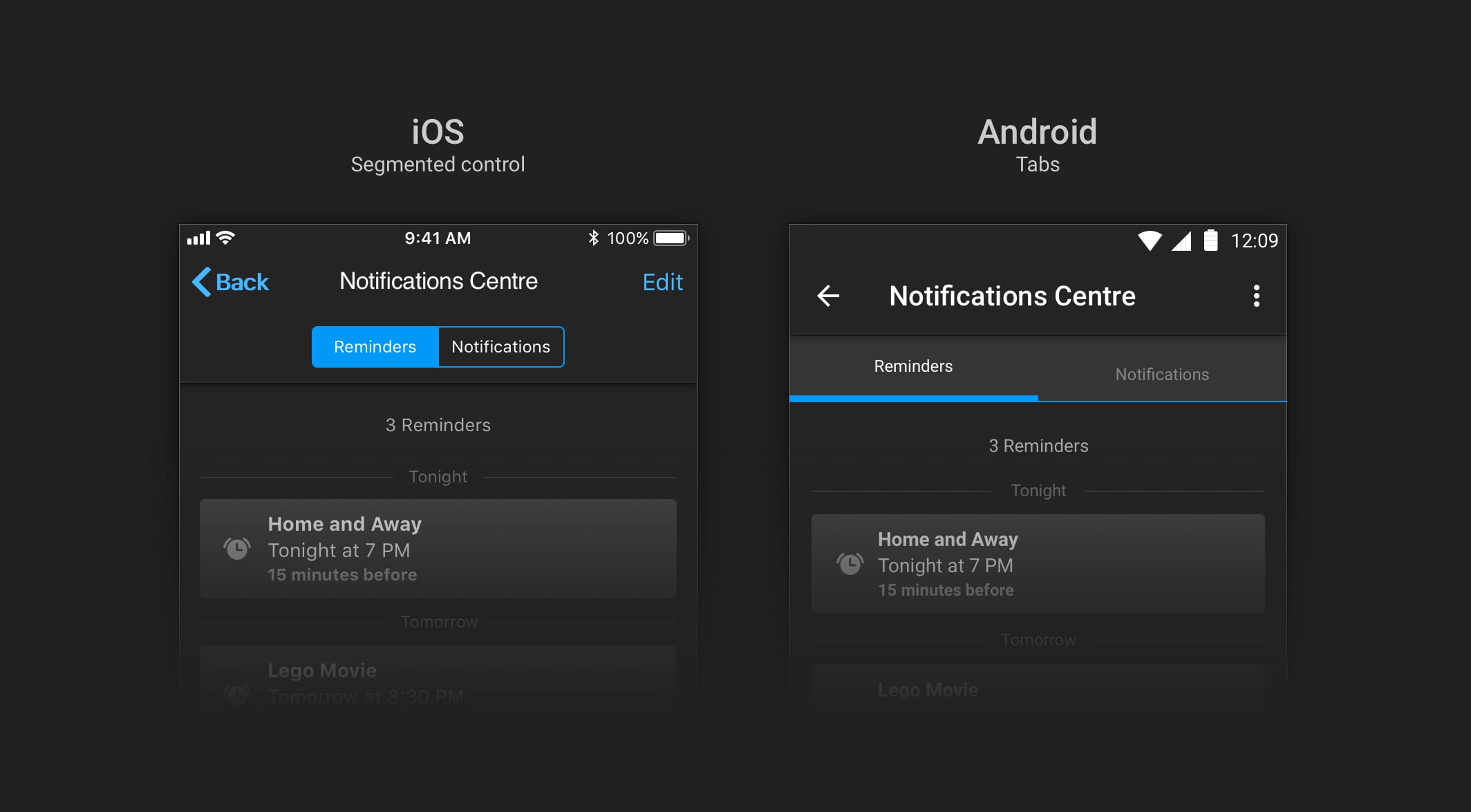
To ensure familiarity across platforms, I followed native design patterns:
- segmented controls for iOS,
- tabs for Android.
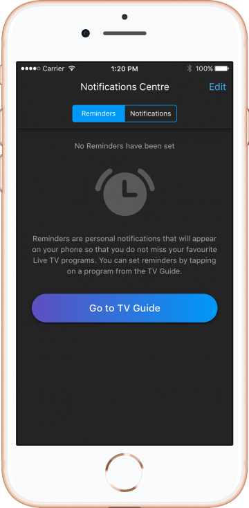
To prevent dead-end experiences, I planned for informative empty states. For instance, if no reminders are set, the screen introduces the reminder feature and offers a shortcut to the TV Guide, encouraging immediate action.
To support user preferences, the system offered three reminder timing options—which I incorporated into my designs.
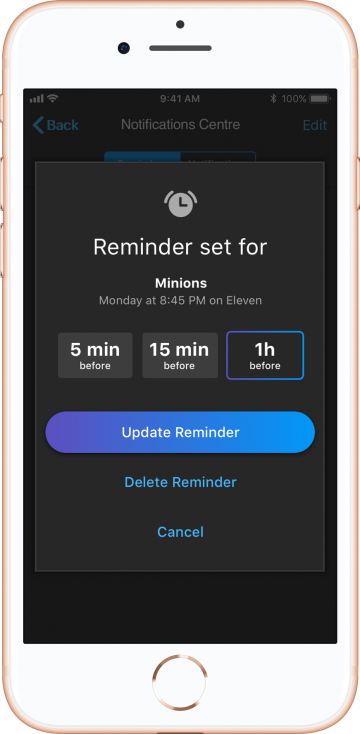
To align with platform guidelines, I used red to indicate destructive actions like ‘Delete’ on iOS, whereas Android did not require any special visual treatment.
Coaching Guides
Helping users get started smoothly is key to an app’s success. A well-designed onboarding experience ensures they quickly grasp essential features and see the value of using the app regularly.
To facilitate this, I introduced ‘Coaching Guides’—short, contextual tips that appeared when users first launched the app or accessed a screen for the first time.
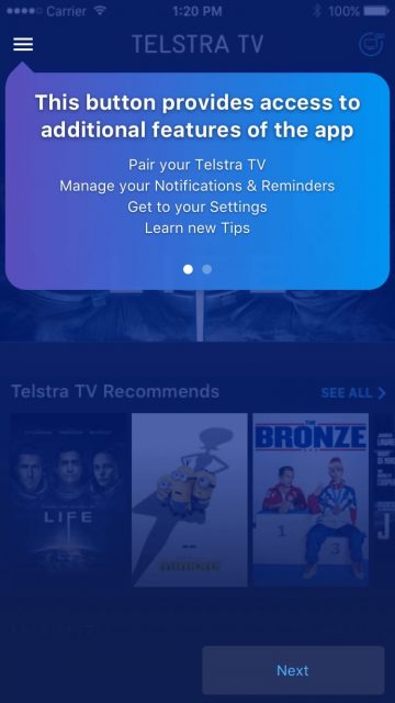
The ‘Hamburger-menu’
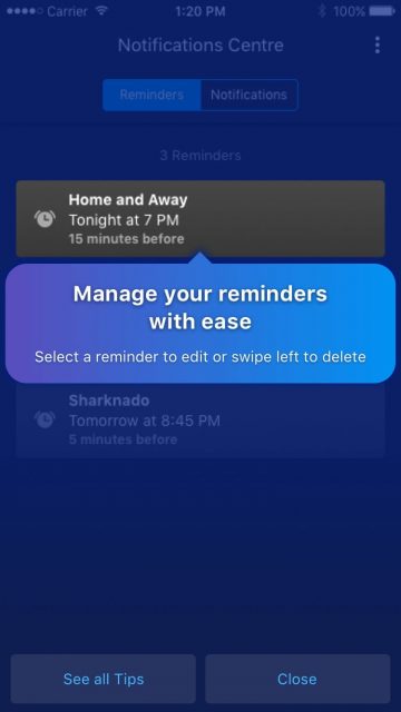
Reminder Management
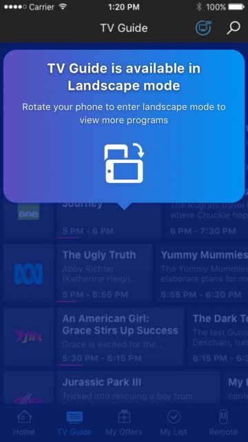
Landscape mode providing better UX
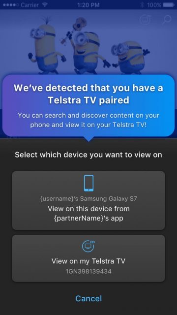
Testra TV detected
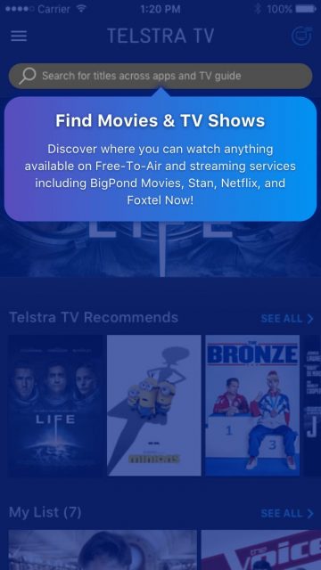
Make use of the search
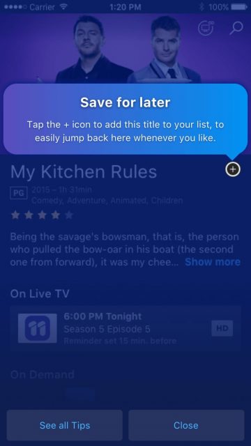
Adding content to watchlist
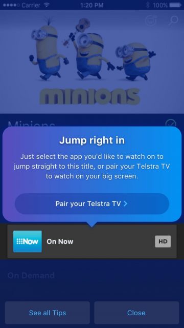
Watch on partner’s app or on Telstra TV
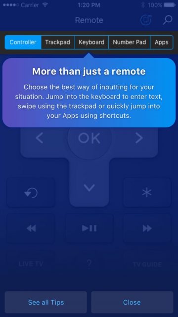
A multifaceted remote
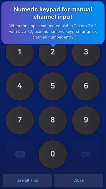
Numeric Keypad
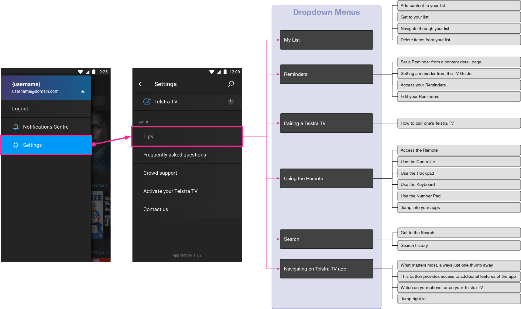
Not everyone wants to read tips the moment they appear. Some users prefer to skip them but may need the guidance later. To ensure accessibility, I made these tips dismissible while also gathering them in the ‘Help’ section for future reference.
2. Self-initiated enhancements
Beyond my assigned tasks, I spotted overlooked UX and UI opportunities and took the initiative to propose thoughtful, quick-win improvements.
Login redesign
The login screen is often a user’s first interaction with an app. If that experience isn’t smooth and intuitive, it’s a missed opportunity to make a strong first impression.

1. Distinctive Top Navigation Bar
The previous design failed to visually distinguish the top navigation bar from the rest of the screen. To address this, I introduced a subtle color contrast and added a clear visual separation to reinforce the spatial hierarchy of UI components—an approach commonly referred to as “Elevation.” This improved clarity and made navigation more intuitive.
3. Input fields with better visual feedback
The original input fields lacked proper state differentiation—default and active states looked nearly identical, apart from the blinking cursor. This created uncertainty about which field was active. I introduced a more prominent active state with a white highlight to provide clear visual feedback.
Additionally, I added persistent labels above input fields to ensure users always had context. Previously, placeholder text disappeared once users started typing, which led to confusion. The new approach aligned with best practices, keeping the form intuitive and reducing input errors.
2. Improved touch target areas for accessibility
The “What is a Telstra ID” component had a limited interactive area, requiring precise taps, which led to usability issues. I redesigned it with an expanded touch target, following platform UX guidelines, to ensure a smoother and more accessible experience. To implement this effectively, I documented the change in Zeplin for developers. Though invisible to the eye, this adjustment significantly improved the login flow’s usability and perceived responsiveness.
4. Password visibility for reduced user friction
Users often struggle with hidden password inputs, leading to errors and frustration. Recognizing this long-standing usability issue—highlighted by Nielsen Norman Group as early as 2009—I introduced a “Show Password” toggle. Positioned on the right side of the password field, this feature allowed users to reveal their input, reducing anxiety over potential typos and improving overall login success rates.
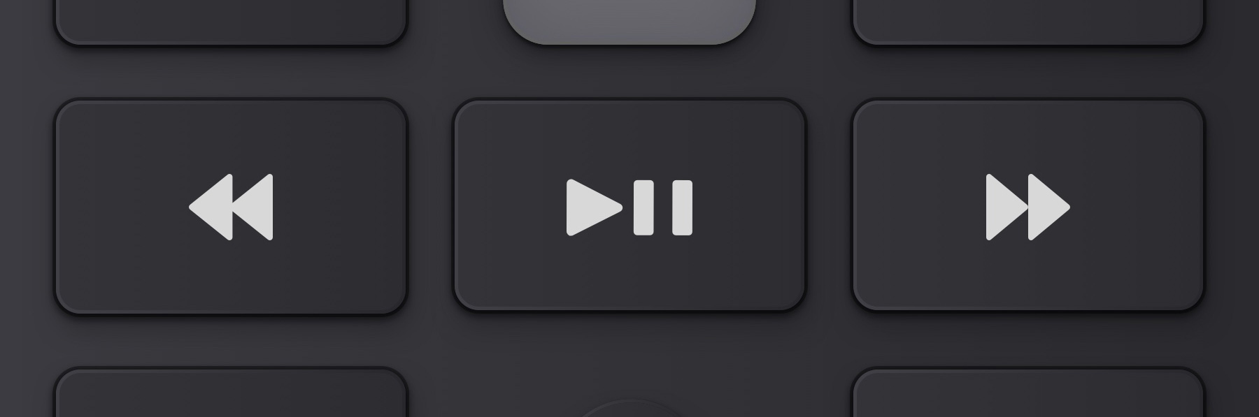
Remote Control Redesign
Noticing that the remote controller’s design was outdated and its interactions could be improved, I took the initiative to suggest a redesign.
Old Remote Control (visually dated)
")
To enhance users’ association between the digital remote and its physical counterpart, I opted for a more realistic look and feel. I redesigned the interface and presented it to the Telstra team, resulting in:
- Stronger visual connection to the real-life remote for intuitive use
- Better space optimization, improving reachability with larger buttons
- More intuitive placement of the ‘Help’ key for easier access

The ‘Help’ button experience needed improvement. The old version relied on an overlay to display legends, but this approach overloaded users with too much information at once. It also created uncertainty—were the buttons still active? How could users exit this mode?
To simplify the experience, I replaced the overlay with a smoother animation that introduced legends more naturally. I also gave users control by allowing them to keep the legends visible if they preferred, with the question mark turning blue as a clear indicator.
Old Remote 'Help' interaction

New Remote 'Help' interaction

I also created a prototype so that we can communicate with more clarity about buttons’ states when tapped as well the transitions.
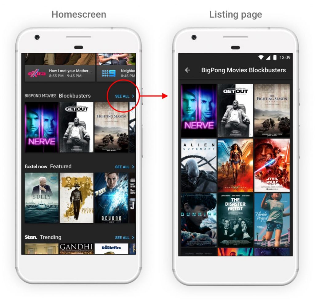
Homescreen
In the original design, the home screen featured multiple content carousels showcasing movies and series from various providers. However, users could only explore this content by scrolling horizontally—an interaction that’s less intuitive and less efficient.
To improve usability, I added a “See all” interactive label to the top-right of each carousel. Tapping it would take users to a vertically scrollable grid view, making it easier to browse larger collections.
This simple enhancement brought:
- A better use of screen real estate
- A more familiar and natural navigation pattern
Navigation UI improvement
The previous UI design wasn’t allowing for much visual distinction between the screen background and the navigation UI components. It’s important to provide a user interface that differentiate content from navigation’s UI components. Given we had to maintain the ‘cinematic’ video watching experience, the dark theme had to be preserved. So I used a mix of bright thin line + shadow to emphasise the elevation.
Difference was subtle, but enough to make a difference in term of user perception.
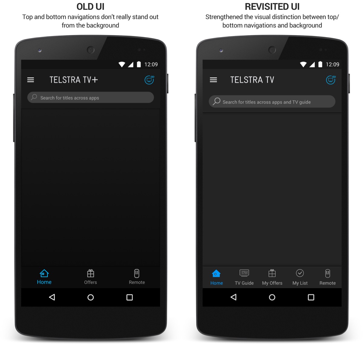
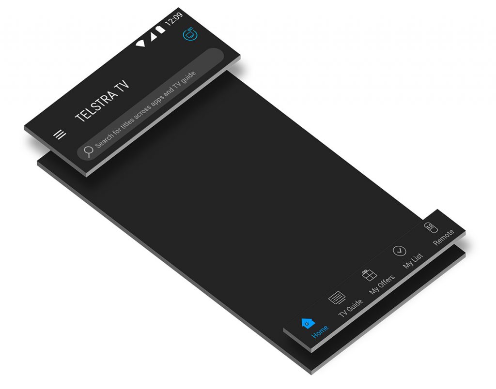
Elevation—a core principle in Google’s Material Design—uses visual depth to convey hierarchy and structure. By enhancing edges and shadows, UI elements appear layered, helping users intuitively understand what stays fixed versus what scrolls.
In my proposed designs, subtle elevation cues were applied to the top and bottom navigation bars, visually separating them from the rest of the content. This treatment reinforces the expectation that these components remain fixed while the underlying content scrolls beneath them.
Information Architecture Optimisation
The previous version of the app used a traditional hamburger menu located in the top-left corner, which opened a slide-in panel.
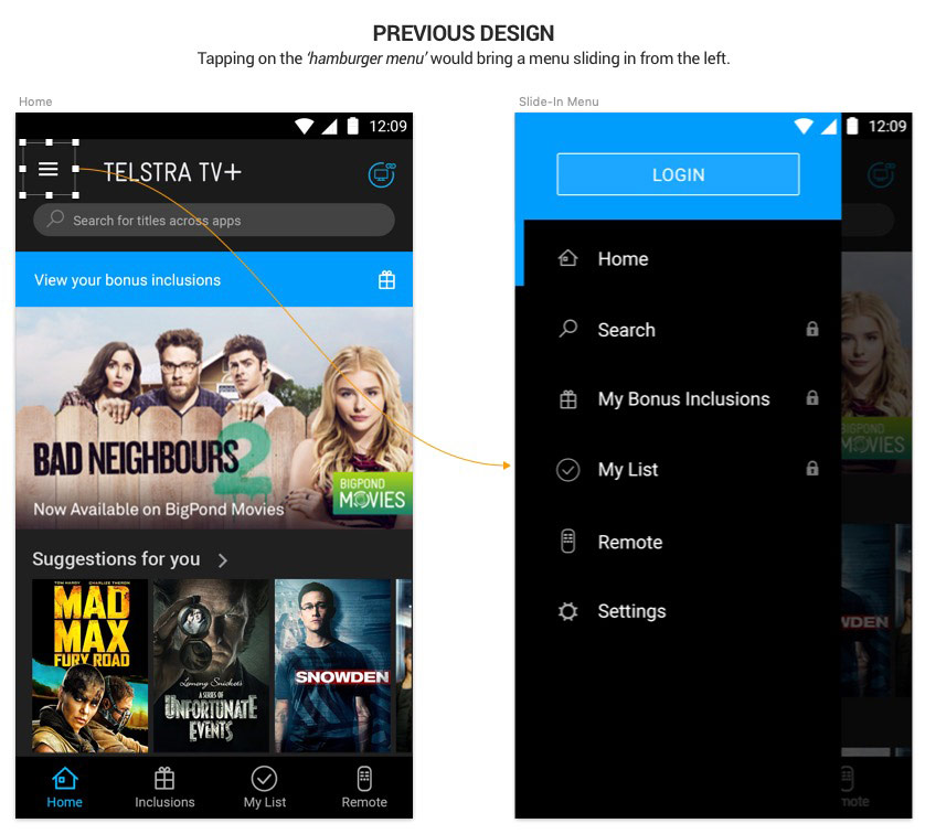
Upon reviewing the app’s navigation structure, I noticed key issues with the Information Architecture:
- Several core sections were duplicated across both the bottom tab bar and the slide-in menu (e.g., Home, Search, Inclusion, My List, Remote).
- A critical feature—the TV Guide—was hardly accessible.
These redundancies and omissions introduced confusion and friction.
Users could question whether duplicated menu items performed the same function. And important features were unnecessarily hidden.
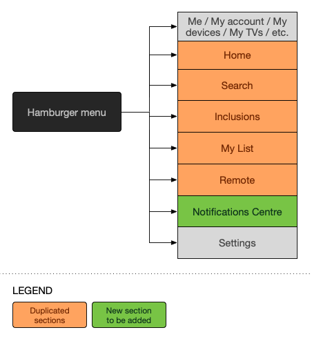
To resolve this, I:
- Removed duplicate entries from the slide-in menu to reduce cognitive load and clarify hierarchy.
- Promoted the ‘TV Guide’ to the bottom tab bar to ensure direct, thumb-accessible navigation to a core feature.

These changes improved clarity, reduced redundancy, and supported more intuitive, thumb-friendly navigation aligned with modern mobile UX best practices.
Results
Joining this project came with a steep learning curve—navigating remote collaboration, integrating with a new client team, and quickly aligning with unfamiliar workflows. As Telstra was a high-priority client in the ANZ region, expectations were high from day one.
After a brief ramp-up period, I found my stride and was able to contribute meaningfully to both the Telstra and Accedo product teams. I not only delivered on my assigned tasks but also identified and resolved UX issues outside the original scope—adding tangible value across the board.
This impact didn’t go unnoticed: two years later (in 2019), I was invited once again to collaborate with the Accedo Sydney team on another Telstra project—an endorsement of the trust and credibility I had built.