
Designing an InsurTech & FinTech SaaS platform
Under NDA — Limited Preview
This case study is part of work completed under a Non-Disclosure Agreement (NDA). Due to confidentiality, some elements have been blurred.
If you’d like to learn more about the project or discuss the design approach in detail, feel free to reach out.
Context
- Company: Coherent.global (InsurTech/FinTech scaleup)
- Position:
- Dec 2020 to Apr 2021: Senior UX-UI Designer
- May 2020 to Oct 2023: Product Design Lead
- August 2023 to Oct 2023: Design System Lead
I joined Coherent in September 2020 and began working on their flagship product, Spark, in December of the same year. Within five months, I transitioned to the role of Lead Product Designer, overseeing a team of two other designers.
Spark, the company’s hero product
Spark is Coherent’s flagship SaaS product—a cloud-based logic engine that transforms complex Excel models into ready-to-use APIs. It empowers businesses to unlock the value of their spreadsheet-based IP with no-code automation, testing tools, version control, and audit trails, all within a secure, cloud-native environment.
For a more in-depth overview of the product, you can watch this video and this additional walkthrough.
Challenges
Highly technical product with steep domain requirements
Spark required deep understanding of the insurance industry, particularly how actuaries work with complex Excel models. In addition to insurance workflows, designing effectively meant grasping spreadsheet logic, Excel-specific behavior, and API architecture.
Design assets not structured for scale
The existing design files lacked structure and were hard to understand/navigate for anyone outside the design team. They weren’t set up with reusable components. Even small updates could become time-consuming, as changes had to be manually applied across multiple screens and Figma pages.
No direct access to end users for research
The Sales team tightly controlled client relationships, limiting the Design team’s ability to engage with users. This made it difficult to validate assumptions or gather first-hand feedback during early stages of the design process.
Approach
1. Building a scalable component Library
When I joined the Spark Product Team, there was no design system or component library in place—resulting in inconsistencies, inefficiencies, and delays. I took the initiative to build a scalable component library from the ground up in Figma, introducing reusable components and documentation. This enabled consistency across product areas while streamlining design and development. It also reduced design debt, and helped onboard new designers and engineers more efficiently.
Extract from the component library

2. Solving File & Collaboration Challenges
Another bottleneck I identified early on was the difficulty navigating the Figma files. There was no consistent structure, no clear naming conventions, and no shared system to track design changes. As a result, stakeholders outside the design team struggled to follow our work.
This lack of structure brought me back to something the Product Owner had shared during my interview a few weeks earlier. When I asked—somewhat playfully—what challenges he faced working with designers, he said: ‘the design process lacks structure’. I’d prefaced the question with a bit of humor to ease any tension, since both he and the Head of Design were present. Now, standing in front of the disorganized Figma files, I immediately understood what he meant.
To bring greater clarity and accountability to our Figma files, I introduced a system of dedicated components tagged with JIRA IDs, designer ownership, and work status. This made it easy for anyone—inside or outside the team—to understand what work was being done, by whom, and where it stood. I also redesigned our handoff approach by embedding clear annotations directly into screens, using labeled legends with visual anchors. This noticeably reduced back-and-forth with developers, and improved the accuracy of implementation.
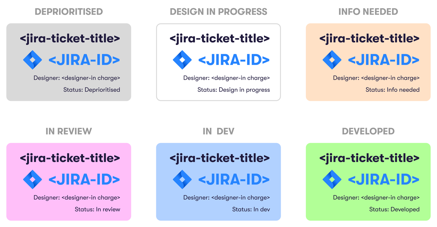
Bringing structure to the design files

Setting up a naming convention for pages in design files

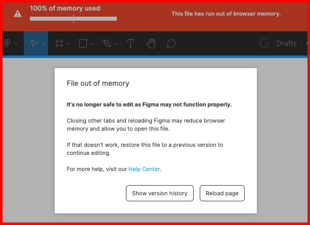
As our product evolved and design iterations multiplied, our Figma files began reaching critical limits. At one point, we were even blocked from editing due to a “File out of memory” error.
To prevent this, we started splitting work into smaller files — each covering 3 to 5 sprints.
But while this solved the technical constraint, it introduced a new one: with so many scattered files, it became increasingly difficult to find the latest designs for a given page or feature.
To bring order to this growing sprawl, I built a centralized Airtable database to track all active and archived Figma files. The system allowed filtering by designer, product area, sprint, and even JIRA ticket — making it easy for anyone in the team to quickly locate the most up-to-date designs. This improved file discoverability, reduced wasted time across the team, and added a layer of operational maturity to our design workflow.
The database for tracking our Figma design files

Filtering the database to return the relevant files

3. Streamlining UX Research & Data-Driven Decisions
To gain buy-in and navigate executive pushback, I leaned on user research. When our design was challenged by the CTO during a product call, we quickly ran internal user testing sessions to validate our approach. Within a day, feedback from seven colleagues—who were representative of our user base and not involved in the project (to avoid bias)—overwhelmingly supported our design. Presenting this data not only resolved the disagreement but also helped earn the CTO’s trust in our process.
With customer access strictly gatekept by the Sales team, we had to find creative alternatives for gathering feedback.
I interviewed new joiners to gather fresh perspectives and used their input to redesign a core journey in the platform.
Collecting new joiners’ feedback at each step of the journey

Selected verbatim quotes from participants

New designs based on qualitative data (with annotations for devs)
")
In this redesign, we applied principles of progressive disclosure to de-emphasize secondary elements and spotlight timely, task-relevant information. The result was a significantly clearer and more focused experience — feedback from customers highlighted the new flow as more intuitive, comprehensive, and aligned with their real-world needs.
To expand our reach, my team and I used UserTesting.com—targeting participants with relevant domain expertise in Insurance and Finance. This gave us access to high-quality feedback through moderated and unmoderated testing, and we used video highlights to share findings with cross-functional stakeholders.
Unmoderated usability testing on usertesting.com

Moderated usability testing recording

To ensure insights were tracked and acted upon, I created a research database in Airtable and collaborated with a UX researcher and a data scientist to combine qualitative insights with product analytics from Pendo. We implemented new tracking events (sometimes requiring dev support), and where needed, we built custom analytics dashboards in PowerBI. These tools helped us identify underused features, guide roadmap decisions, and redirect resources toward areas with greater user impact.
The UX Research database I built on Airtable

Analytics in Pendo.io

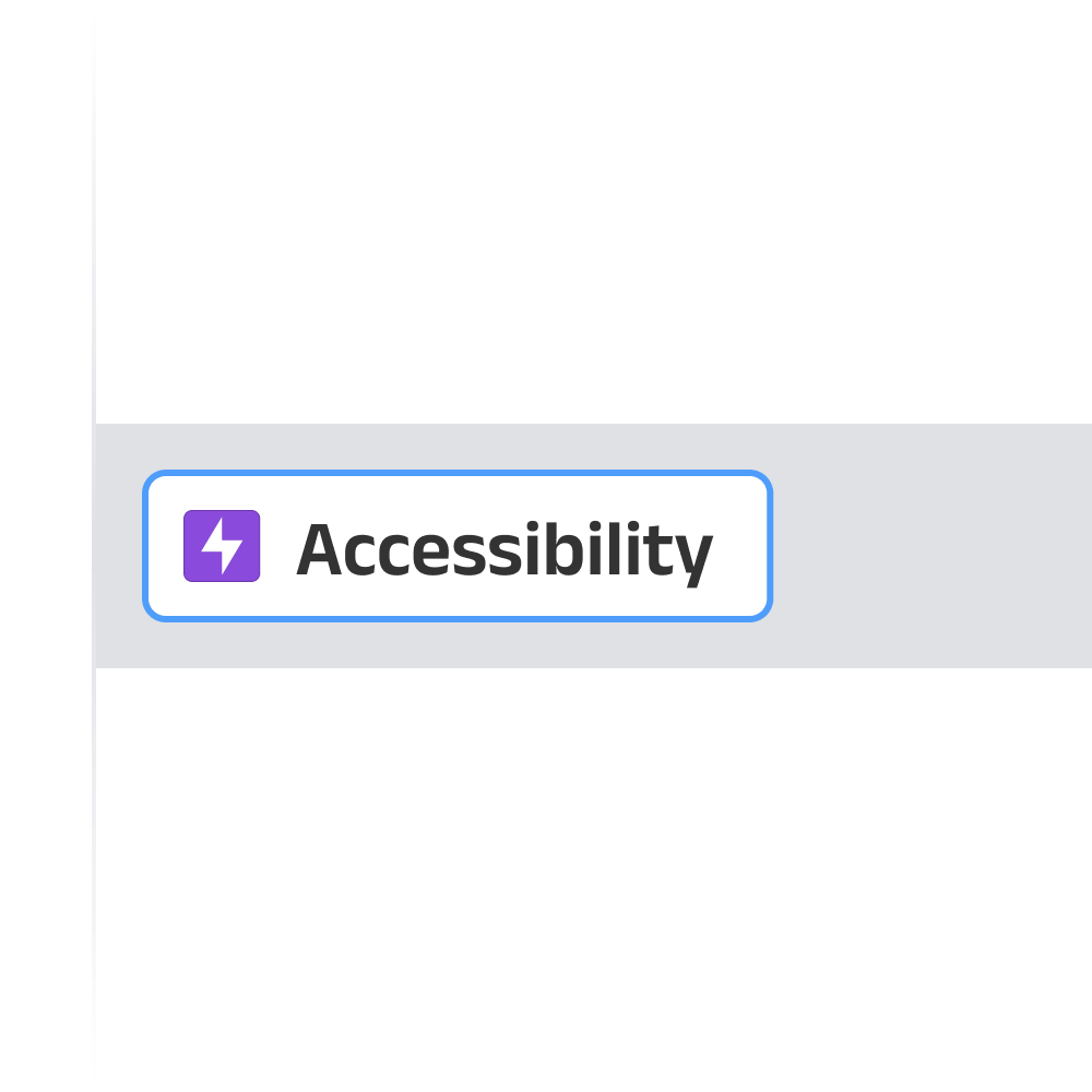
4. Embedding Accessibility into our Designs
As the US became our primary market, accessibility moved from a best practice to a business-critical priority due to the legal risks of non-compliance with ADA standards. Seizing this opportunity, I created an “Accessibility” Epic in JIRA and led the effort to scope and assign accessibility tasks across our team. This included improvements to color contrast, font readability, keyboard navigation, focus states…
Some updates were quick wins; others required deeper design and engineering collaboration. We prioritized fixes that had the highest user and compliance impact.
While we didn’t reach full WCAG AAA compliance, addressing the most critical gaps significantly reduced our exposure to accessibility-related lawsuits—while also improving usability for everyone.
5. Driving Cross-Functional Collaboration
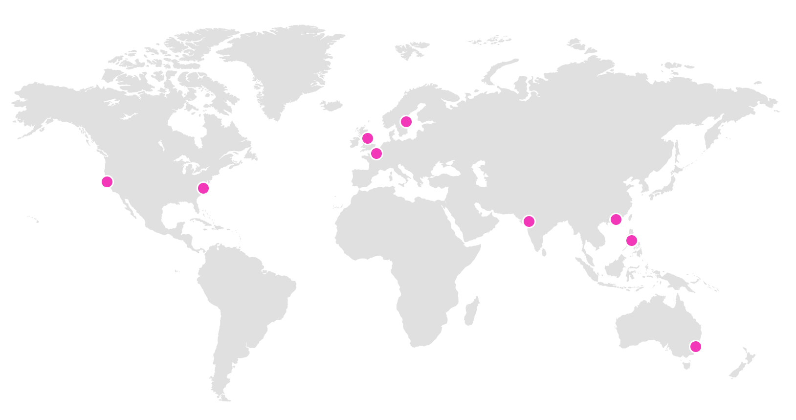
At Coherent, working across time zones and cultures was the norm. As Product Design Lead, I played a central role in aligning cross-functional efforts with teams distributed around the globe.
I had daily syncs with engineers/designers in Hong Kong, India and the Philippines to ensure design intent was understood and implemented accurately. Regular collaboration with PMs in Europe helped us keep strategy aligned, while frequent calls with our colleagues in the USA enabled effective knowledge sharing across disciplines. I also supported occasional projects with teammates in Australia and New Zealand.
These global touchpoints strengthened cohesion across functions and allowed us to deliver consistently, despite geographic distance.
Impact
The design system and component library I established significantly improved team efficiency — UI updates that previously took weeks were completed in just days.
Our research-driven approach to design led to a noticeable reduction in usability issues and created a more intuitive user experience across the platform. By backing decisions with real user insights and data, we accelerated stakeholder alignment and reduced friction in product discussions.
The structured, scalable design processes I introduced became a solid foundation for future team members, enabling consistency and easier onboarding.
Additionally, by ensuring our designs met accessibility standards, we helped the business reduce legal risks, particularly in the US market.