
Les Mills – Designing for the future of fitness
Context
- Year: 2018
- Role: Senior UX-UI designer at Accedo.tv
- Location: Hong Kong, Auckland (NZ)
October 2018: the last remaining UX Designer at Accedo’s Auckland office is resigning, following another designer who left during the summer. This poses a risk of losing critical design knowledge, particularly regarding our most important local client, Les Mills.
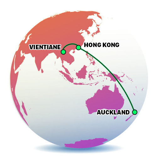
While I’m on a well-deserved break in Laos, my manager calls to tell me that I must fly straight to Auckland immediately upon returning to Hong Kong.
The client
Les Mills is a New Zealand-based company that operates gym facilities and creates globally distributed group fitness programs. Their 23 workout programs—including BODYPUMP™, BODYCOMBAT™, and LES MILLS GRIT™—are available in over 20,000 clubs across 110 countries and delivered by 140,000 accredited instructors to seven million participants weekly. Programs are updated quarterly with new choreography, music, and instructor training.
Challenges
- Immediate immersion: quickly acclimating to a new project, client, country, office, and team of colleagues/stakeholders.
- Rapid knowledge acquisition: gathering as much knowledge as possible from the departing designer—within a tight timeframe of just two days.
- Seamless transition: ensuring that the staffing change has no impact from the client’s perspective. Maintaining the same cadence of value delivery through professional and high-quality designs.
- On-site recruitment: leading designers interviews so to replace the positions left vacant.
Approach
Harvesting information about projects
Upon arriving in a new country, joining a new team, and taking on projects for a new client, countless questions emerge:
- Who are the stakeholders we’re dealing with?
- Who is responsible for what within the team?
- What is this feature/component there for?
- When was this designed and why?
- What problems did the team face?
- What is the priority of each task?
- Etc.
Collecting responses and maintaining an organized record of information is vital. During my initial weeks at the Auckland office, I compiled, aggregated, and categorized as much knowledge as possible in Google Sheets.

Kicking off the hunt for user data
1. Survey
I quickly realised that we were missing user data and that designing based on assumptions could be risky. For instance, we had limited insights into how gym club owners were using the LesMills Virtual app. To address this gap, I took the initiative to create a survey to swiftly gain an understanding of the user experience and identify key friction points.

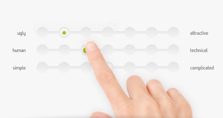
2. User interviews + Attrakdiff
Similarly, I identified a significant gap in user data for the “Releases” mobile app designed for LesMills instructors. To address this, I quickly formulated a list of questions to assess app usage and pinpoint urgent friction points.
To gather qualitative data, I purchased a one-month gym subscription at LesMills and visited the gym at 7AM on week days (before going to the office) to interview instructors.
Here are some key findings:
- The top carousel on the home screen is not recognized as swipable by some users.
- Several instructors prefer using their own music apps instead of the LesMills Releases app due to reliability concerns.
In addition to interviews, I had the instructors complete an AttrakDiff survey to evaluate the app’s usability and visual appeal. This survey distinguishes between pragmatic quality (usefulness and usability) and hedonic quality (emotional needs, such as curiosity and identification). By combining these factors, we could gauge the app’s overall attractiveness and identify areas for optimization.
Thanks to the AttrakDiff tool, we started to track progress over time, with the resulting data presented in graphs, making it easier for us to identify trends.
Version Control + Design System

Sketch + Abstract: version control for our design files
When I started navigating through the design files (on Sketch back then), my challenge was gaining clarity in their organizational structure. Previous designers in the Auckland office stored files across multiple Google Drive folders, some labeled by date, and others by iteration number. Sometimes, with the most up-to-date screens being scattered across different files, often contradicting the iteration numbers.
This disarray made it difficult for me and would similarly affect new hires. And since one of my missions there was to recruit new designers, I had to pave the way for a good onboarding.
Therefore I decided to upload all the latest design files on a version control tool called Abstract. This ensured a single source of truth for design while enabling multi-designer collaboration, version tracking, commenting, sharing…
Same logic as Git: designers would now be able to create branches, merge, manage conflicts, etc.
A model for scaling design effectively: one unified Design System providing consistency across three LesMills products

While hosting all our files in Abstract, I also created a specific project dedicated to the Design System. Since we had 3 projects for Les Mills (related to 3 different products from them) it was a good time to start creating one. That would help to maintain consistency and avoid the duplication of components on different design files. Resorting to a Design System would allow designers to pull components from the Design System library file(s) to a project-specific file.
For any update made to the library component, all its occurrences would be updated accordingly. That was also the place where we would gather, reference and describe all the elements related to design components, copy-text, implementation…
‘A Design System is always a work in progress’.
Design support: maximizing immediate impact
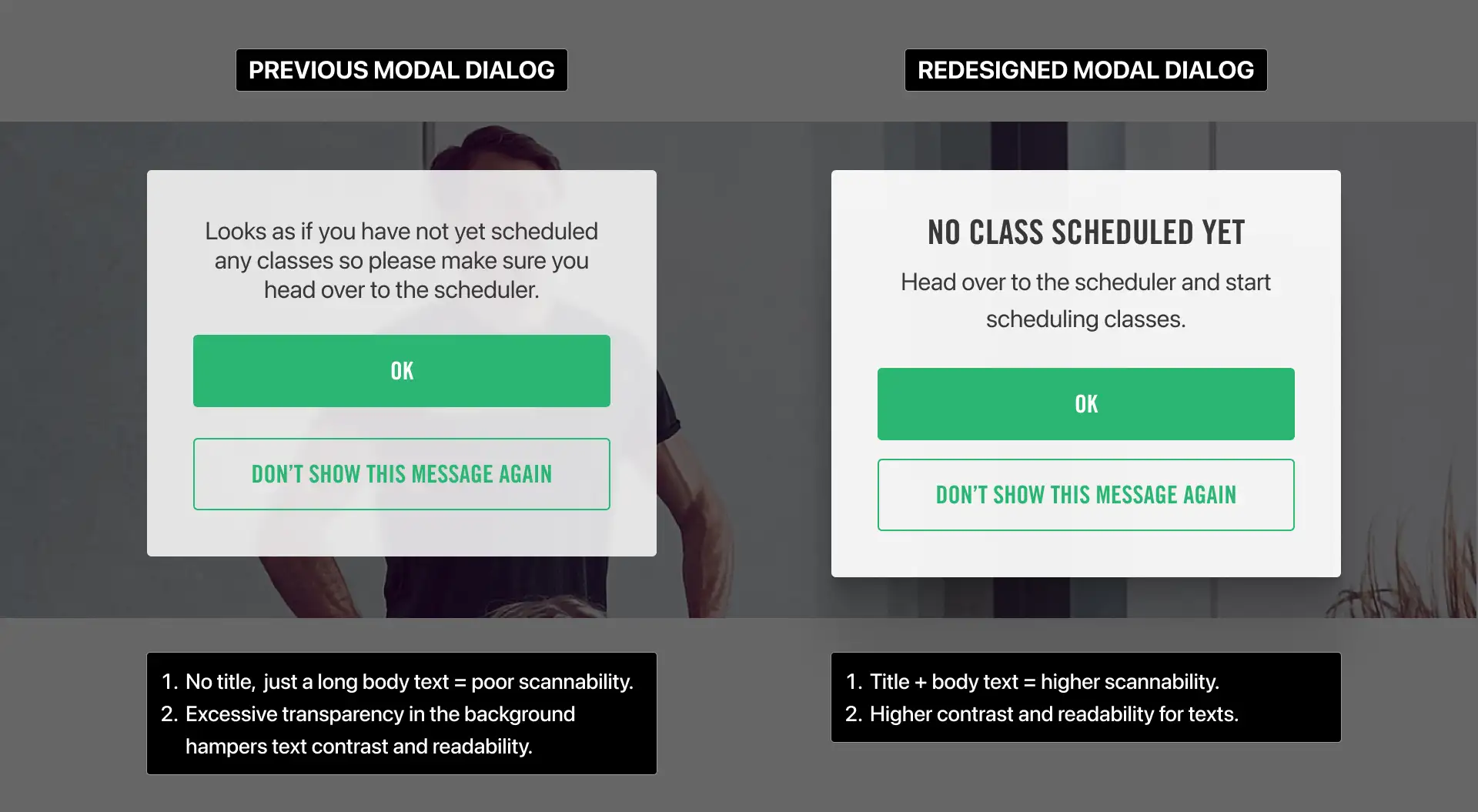
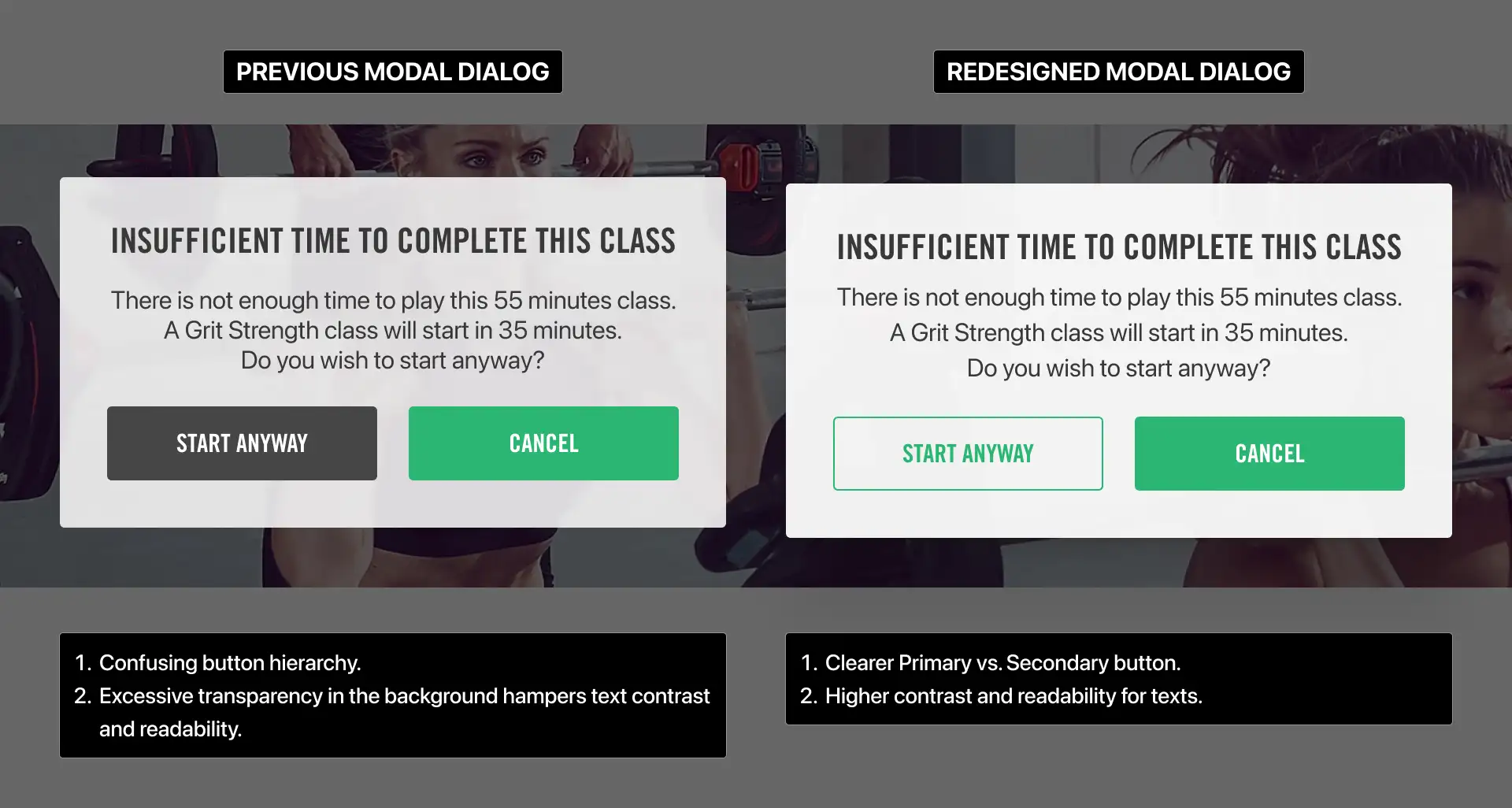
Standardizing modal dialogs
While reviewing the design files, I quickly identified several ‘low-hanging fruit’ issues that could significantly enhance the user experience if addressed. One notable area was the modal dialogs.
Modal dialogs audit

The issues I discovered included:
- Many dialogs contained only body text, lacking a title. This made it difficult for users to quickly scan the information. Users often benefit from having a clear title to grasp the context without reading the entire text.
- There was inconsistent styling among the modal dialogs, with variations in both the darkening scrim and dialog background depending on the context.
- Not all dialogs met accessibility standards, particularly in terms of contrast.
- The secondary button often had more contrast than the primary one, which caused confusion and increased the risk of mistakes.
Customisable Navigation – Les Mills Virtual
Les Mills Virtual is an iPad app for gym facility owners, allowing customers to browse class timetables and play virtual classes when no instructor is available. The app enhances studio utilization, offering more flexibility for gym members.
Les Mills wanted gym owners to customize the app’s navigation—choosing which sections to display and setting a default screen that resets after inactivity. The existing approach, using mutually exclusive switches, was unintuitive and limiting.
I designed a flexible UI with drag-and-drop reordering and visibility toggles. The default screen remained fixed to ensure clarity. This solution was intuitive, future-proof, and quickly implemented in collaboration with the iOS dev team. It empowered gym owners with a seamless, customizable experience, aligning with their specific needs.
I built the logic for this prototype in Protopie

Dark mode and UI-revamp
Goal: increase workout discoverability
User Stories:
1. “As a gym subscriber, when a studio is free, I want to be able to browse through available virtual classes so that I can pick one and play it on big screen”
2. “As a gym staff, when a studio is free, I want to be able to browse through available virtual classes so that I can pick and play the one that fits the needs of the audience”

Below is a video of a quick prototype I made to show how a user could filter through videos. The design caters to both mental models of looking for a workout either by type or name.
Impact and results
By quickly assimilating into the Accedo Auckland Product Team, I ensured a seamless transition, maintaining the same cadence of high-quality design delivery for Les Mills—the office’s most important client. Despite the tight two-day knowledge transfer, I rapidly onboarded, took ownership of key features, and delivered urgent design solutions without disruption.
Introducing a data-informed approach, I shifted the team’s design decisions away from assumptions and towards user research, leading to more effective and user-centered solutions.
Beyond fulfilling client requests, I proactively identified and designed low-effort, high-impact improvements, adding further value to the product range.
To improve operational efficiency, I restructured the design workflow by implementing a robust file versioning system. This new structure provided clear documentation, version history, and branching capabilities, ensuring smoother onboarding for future designers while aligning better with developer workflows.
Additionally, I led on-site recruitment efforts, collaborating with design managers in Hong Kong and Sydney to hire a strong replacement. By the time I left New Zealand in December 2018, we had successfully secured a skilled designer—who remains with the company as of 2025.